- macOS 27 Golden Gate has fixed menu icons on your Mac
- Menus are no longer filled with unnecessary icons
- This makes it much easier to find things at a glance
Apple’s macOS Tahoe operating system has received its fair share of criticism, particularly when it comes to design decisions. One of the most controversial was how it used icons in menus, but now it appears that macOS 27 Golden Gate shown off at Apple’s WWDC 2026 event has completely backtracked – much to the relief of long-suffering Apple fans. And that has big implications for anyone who wants a better experience using their computer.
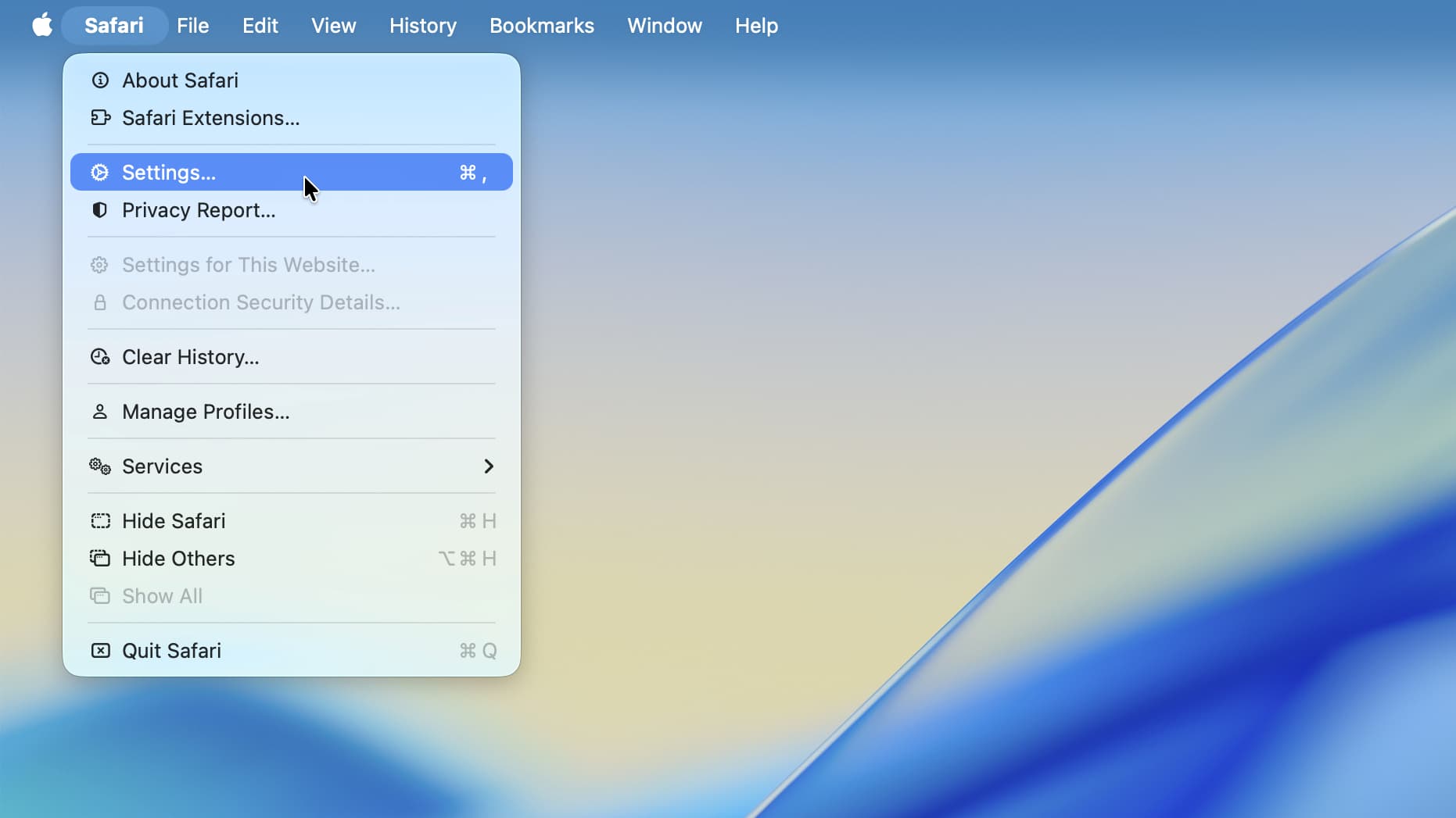
The problem in macOS Tahoe was that app menus were filled with icons, making it very difficult to tell the difference between menu items at a glance. In macOS 27, this was removed entirely, as programmer Nikita “Tonsky” Prokopov noted, with most menus now containing only a handful of icons.
Now only some menu items have icons, others remain simple text entries. This restores the menu design as it was and significantly reduces visual clutter in macOS menus, reducing the work required to distinguish menu options.
In addition to the design change, Prokopov noted that Apple also updated its guidelines for third-party designers, reminding them to “use menu items sparingly and wisely.” Icons should be used to “highlight the most common actions and key features of your app,” Apple says. If a menu item doesn’t match an existing icon, it probably shouldn’t be used.
Better late than never
Menu design may seem like a niche issue, but it can have a big impact on the way you use your computer.
If you have to scan handfuls of icons every time you open a menu, it slows you down and can lead to frustration. The whole purpose of an icon is to quickly convey meaning: if a menu is full of icons, an icon’s meaning quickly gets lost among the sea of competing visual elements. It’s a small thing, but it fits into a bigger picture: good design makes a product easier to use; poor design makes it infuriating.
The situation was so bad in macOS Tahoe that it left prominent Apple commentators livid. Influential blogger John Gruber, for example, called macOS Tahoe’s menu icons “blatantly inconsistent and often completely inscrutable.” Respected macOS developer Rogue Amoeba called them “infuriating.”
This isn’t the first time Apple has encountered icon issues. Both macOS Tahoe and iOS 26 shipped with transparent icons that hindered your ability to distinguish icons at a glance. It felt like Apple didn’t understand the basic principles of good design – and this is the company that’s supposed to be a world leader in design.
For me, the worst part of all this is that Apple’s menu design in macOS Tahoe broke his own rules. As Prokopov pointed out, Apple’s Macintosh human interface guidelines from 1992 stated that icon-filled menus could “overburden the user.” And yet he still went ahead and ignored his own advice in macOS Tahoe, often reusing the same icons for different menu items, sometimes right next to each other.
All of this contributed to my desperate feeling that the visual language of macOS Tahoe was much worse than I initially thought. Under the leadership of now-deceased design chief Alan Dye, it seemed like Apple naively thought design meant taking something average and painting it in pretty colors, functionality be damned. In other words, this is exactly the kind of superficial thinking that Apple founder Steve Jobs has railed against in the past.
Still, with macOS 27 fixing its menu icons and Alan Dye sidelined, things are looking up. Getting things right in your Mac’s menus may be a small step, but it suggests that Apple is starting to remember why good design makes everything better for its users. As Gruber says, “It’s proof that the rot has been rooted out of Apple’s software design team.”
![]()
Follow TechRadar on Google News And add us as your favorite source to get our news, reviews and expert opinions in your feeds.